If your lawn or landscape business has its own Facebook page (which it should!), you need to make sure that you’re taking advantage of a big opportunity to make a solid first impression: your cover image. It’s what potential customers see when they first land on your page, and it takes up a lot of real estate – so why not use it to show off?
Facebook cover image rules
Facebook has some basic rules for cover images. You should read them for yourself, but the most important is that your cover image can’t be deceptive or misleading, and it can’t infringe on anyone’s copyright. In other words, if it’s someone else’s image and you don’t expressly have the rights to it? Don’t use it! This is great advice for the internet in general, really.
Facebook has set the size for cover images at 851 x 315 pixels. If you’re not sure how to resize images to fit, or if you just want a simple solution, you can use a free tool like Canva. Canva lets you create images that are sized just right for a lot of social media sites, and you can’t beat the price.
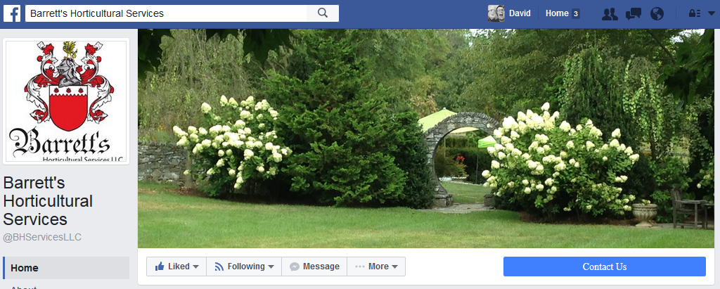
A picture is worth a thousand words, so let it do the talking for you. Barrett’s Horticultural Services offers plant care and horticultural maintenance for estate clients in northern Virginia. Their cover image shows an example of the type of garden they care for, making it easy for prospects to tell at a glance if they’re the right type of company for them.
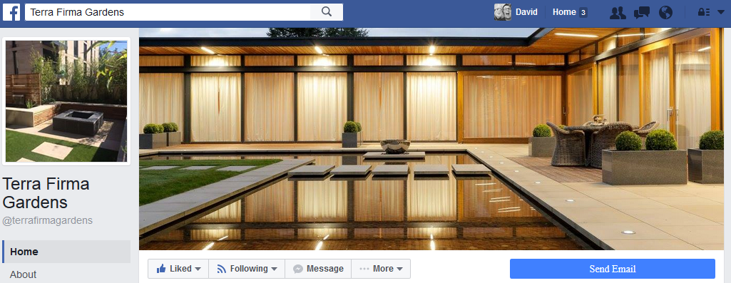
Terra Firma Gardens is a British landscape company that does beautiful work with a contemporary feel. This cover image nails that, with a brightly lit photo of one of their projects. A client looking for that style will immediately know they’re in the right place.
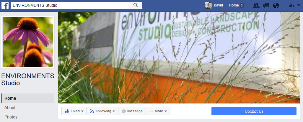
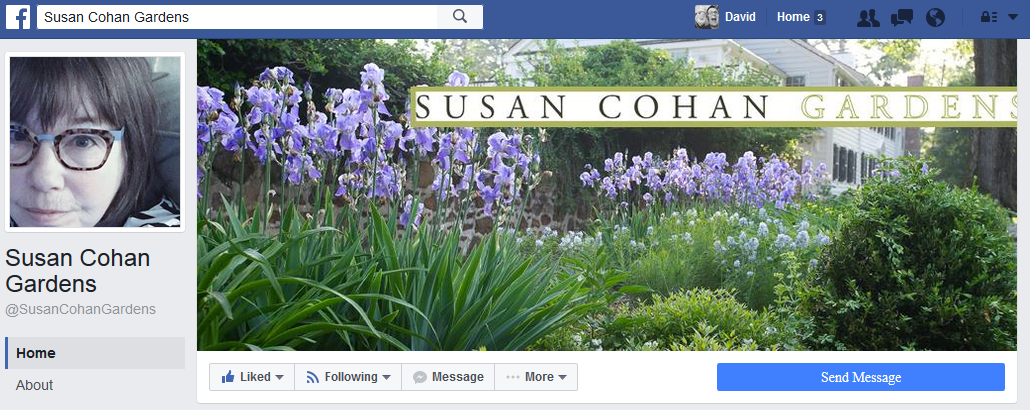
Facebook used to have a rule that your cover image couldn’t contain more than about 20% text. They’ve backed off that rule but it’s still a good idea. After all, that cover image should have some wow factor, especially for an industry that’s so visual in nature. A little text is good for reinforcing your brand or showcasing a special offer. Here are examples of two landscape companies with very different styles, emphasized with their cover images.
Environments Studio is a landscape architecture firm in Illinois. They do a lot of work with stormwater management and sustainability. They clearly have a different style than Susan Cohan, a landscape designer in New Jersey:
Isn’t it amazing how two simple images can tell two completely different stories? It’s a powerful, powerful opportunity.
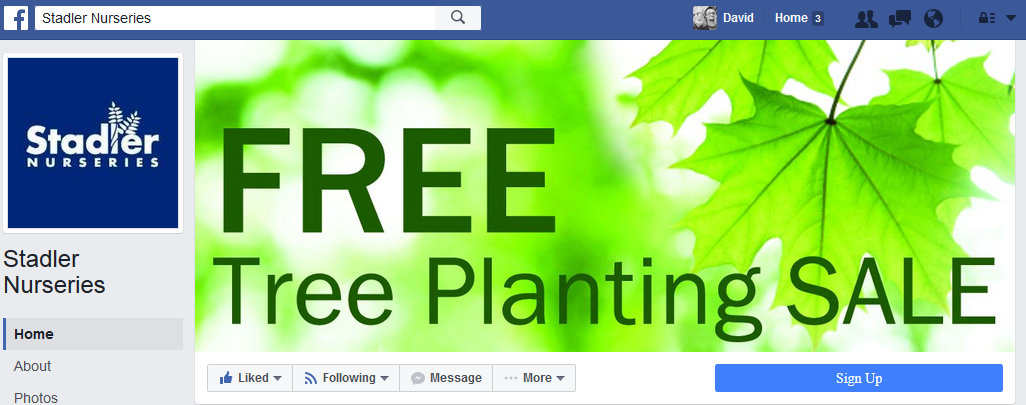
For an example of a company using their Facebook cover image to communicate a special offer, Stadler Nurseries does pretty well. They’re a family-owned retail garden center with locations in Virginia and Maryland, and their tree planting sale is a huge promotion for them every year. While I don’t often love the use of stock photos, the bright green is eye-catching and the simple image puts all the focus where it needs to be: on the special offer.
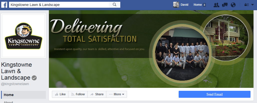
While it’s not a special offer, Kingstowne Lawn and Landscape uses their Facebook cover image to tell us their value proposition: “delivering total satisfaction”. It also shows that a cover image doesn’t need to be just one image. The two inset images weren’t selected by accident. The image of the home they selected appeals to a wider range of customers than the typical mansion-style homes landscape professionals love to feature. The photo of Kingstowne’s team helps put a human face to the company.
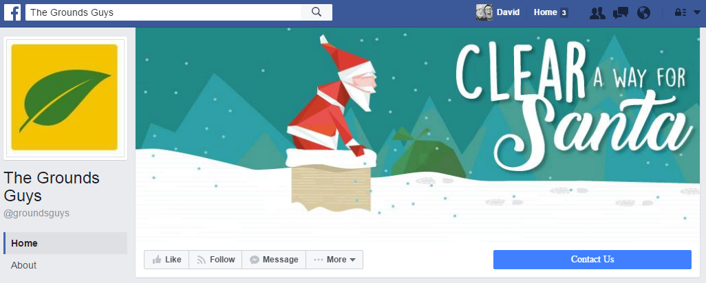
What about snow removal? The Grounds Guys is a landscape maintenance franchise with locations around the United States. It’s currently December which means it’s time for customers to think about snow and ice management. The Grounds Guys make this pitch in a pretty playful manner:
The bottom line
What’s the takeaway here? Personally, I think your Facebook cover image is a wonderful opportunity for your landscape company to show some personality. We’ve showcased several examples that each stands out from the competition in its own way. Do you want a potential client calling 5-7 random companies in your area? Or do you want them calling YOU? Like Jules says in Pulp Fiction, “Personality goes a long way.”
Not sure how to make your Facebook page better? Do you need help with your online marketing efforts in general? We’d love to help! Contact us today and we’ll review what you have now and how we can make it better. Your competition will wonder what the heck just happened!

